


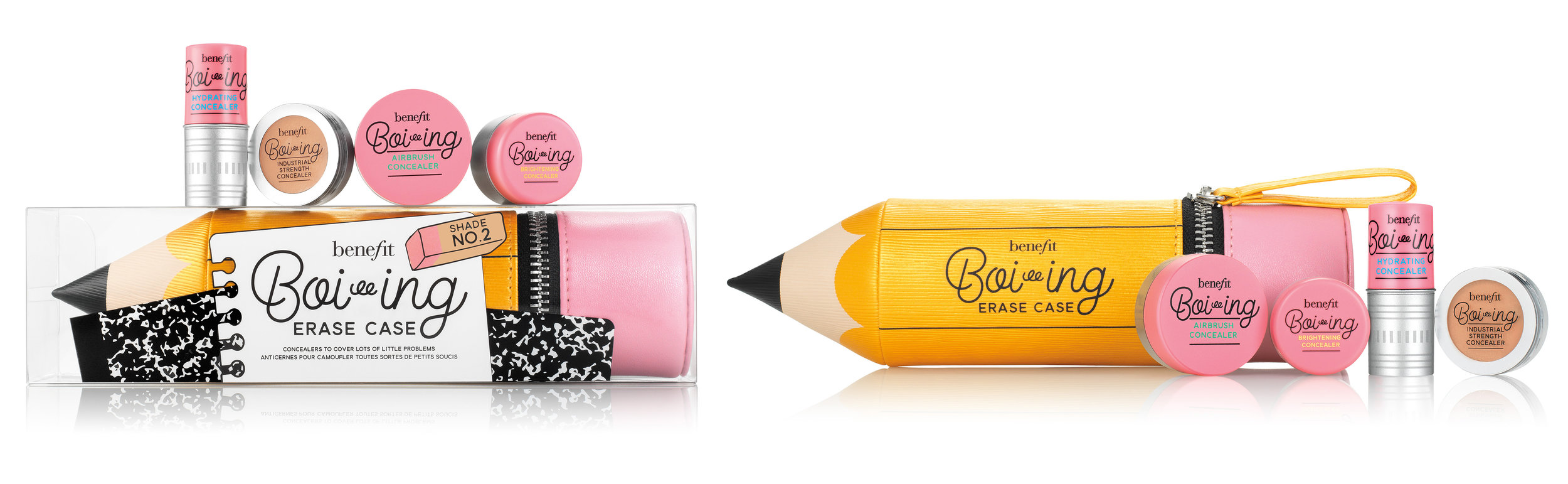


Benefit released some best-in-class concealers designed to "erase" your complexion concerns. I designed the eraser shaped packaging and art directed the youthful and weird campaign for the concealer collection.
My role: Concept and art direction for advertising campaign, photo and video shoots, guidelines for cross-functional launch expansion and activations, packaging and product design, and illustrator partnership/management. Close collaboration with strategic marketing, product, industrial design, engineers, PR, education and digital.
Benefit released some best-in-class concealers designed to "erase" your complexion concerns. I designed the eraser shaped packaging and art directed the youthful and weird campaign for the concealer collection.
My role: Concept and art direction for advertising campaign, photo and video shoots, guidelines for cross-functional launch expansion and activations, packaging and product design, and illustrator partnership/management. Close collaboration with strategic marketing, product, industrial design, engineers, PR, education, and digital.
The campaign features a quirky teacher character that pops out when you need to "erase" life's little problems.
The packaging designs are simple and shade matched with a soft touch varnish to feel like a real eraser. The products have silver metallic details like a real pencil.